Gimp tutorial: Brightness, contrast, hue and saturation
Gimp Tutorial: easily adjust brightness, contrast, hue and color saturation in a photograph for basic photo editing in few seconds.

With Gimp it is possible, in a really easy and immediate way, to balance the exposure of a photograph (lighten or darken it), increase or decrease the contrast and adjust the hue and saturation of the color. These steps, that are the ABC of photo editing, are actually almost always necessary, or in any case recommended, to fix any photograph. Gimp also provides much more precise and advanced tools than those we are going to see in this tutorial, but you may prefer to not complicate your life. So remember that this tutorial is dedicated to those who are looking for the easiest and fastest way to adjust brightness, contrast. hue and saturation, but certainly this is not the best way to work. If you are looking for more precise, correct and advanced tools, I invite you to read the tutorial about the exposure and contrast adjustment using the histogram on the Gimp Level Tools or, even better, the tutorial for exposure and contrast adjustment using Gimp curves. About the corrections of hue and color saturation only, this guide is indicated as a complement to the two that I have linked above.
Let's start
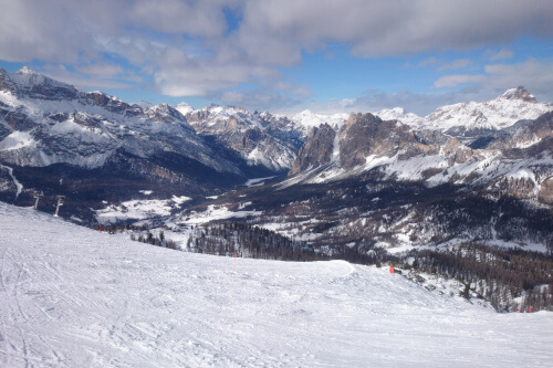
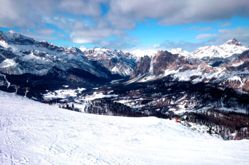
If you are still here, it means that you don't want anything advanced, in this case the combination of the Colors → Brightness-Contrast tool and Colors → Hue-Saturation tool will allow you to improve your photograph in few seconds. I will use a photo taken with my phone during a ski trip. I want to be clear: I'm not fully satisfied with the result, but let's see the photos first, we'll be back on problems on the conclusion of the turorial:
Brightness and contrast
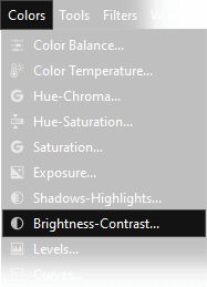
Let's start by adjusting the brightness and contrast of the photograph. There are no correct parameters for these settings, it depends a lot on your personal taste and from the photograph. Remember that SLR cameras will take less contrasted photos than compact cameras and phones. The only advice I can give you, is not to overdo it. Proceed by open the window Colors → Brightness-Contrast and change the settings on the two scroll bars as you prefer, I used these parameters:
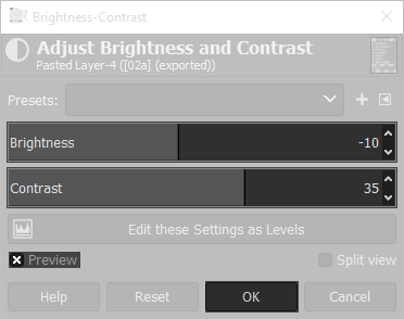
The brightness lightens or darkens the image as a whole, raising it too much will turn black into a dark gray, lowering it will turn white in a light gray. You can easily do some tests to see the results, with a correctly exposed photo it will be hard to use an intensity bigger than +/-10. Generally is better to adjust the contrast before the brightness. Very often the contrast will burn out (over expose) the very bright areas, so it is generally necessary to reduce brightness to compensate.
The contrast technically is the visual ratio of different tones in an image, to put it simple, we can say that it determine the "clarity" of an image: the greater is the contrast, the greater is the difference between light and dark tones, while the medium tones remain unchanged. A pratical example is a photo in a cloudy and foggy day: it has low contrast, because everything is "greyish". Be very careful because exaggerating with the contrast will "burn out" the highlights and shadows. This means that there will be a loss of detail, because light colors will become completely white areas and dark colors will become completely black areas. To adjust the contrast more precisely, without losing details in the light and dark areas, you will have to study how Gimp curves work, you can find more infos on this tutorial.
Hue and color saturation
Even in the color saturation adjustment there are no right or wrong parameters, it depends on your personal tastes, but as before, be careful to not to overdo it. On the contrary in the hue adjustment, it is possible to make a mistake, as I will explain below, but first let's see what parameters I've used in the menu Colors → Hue-Saturation:
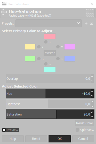
Hue is a parameter that normally does not need to be changed. By changing it, we are going to completely change the tones of the photograph, with often disastrous results. Normally digital cameras are very good at figuring out which colors are right, so normally it has to be leaved at zero. However, there are borderline cases in which it is possible to improve the result. Let's go back to our photo, all that white snow has made the phone going a little crazy, so it has given to the colors a slight shade of red. To correct this little problem I lowered the Hue to -10, moving the color slightly towards blue. Ideally, in a photo of a sunset, we could need to push a little tones towards red, putting a positive value. To better understand this part, you should know what "white balance" is, if you dont here you can see a tutorial. This part will be updated, but as I've already said it could be ignored, becasue 99% of the times your photo will have correct colors.
Saturation determines the intensity of the colors. As saturation increases, all the colors of the image come to life, light up and increase their brilliance. An image that is too saturated is less realistic and many times, especially with skin tones of human subjects, it becomes objectively ugly. So be careful to adjust it correctly. In naturalistic photographs (as example a photo of a sunsets), or in the case of cloudy and greyish days, it allows you to give to your photograph that "something" that is missing. The parameter can be easily changed by +20/+30 as it is much less sensitive than contrast and brightness. Setting saturation to zero leads to a black and white image, but it is the wrong way to proceed. If you need a perfect black and white photo, I recommend you read this tutorial about the mono mixer, a Gimp tool that is amazing for black and white photography.
What's wrong with this post production and how to fix it
I have certainly exaggerated a bit with the parameters, but it is to make you understand what you can get. To understand what I've done wrong, you have to look at some parts of the snow, or the mountain
in the center on the background. They are definitely burnt out. I mean that they have lost details, becoming completely white. This is because I've exaggerated a little with the contrast. You can simply
use a lower parameter on the contrast to avoid these problems, but maybe you don't want to do it. In this photo the problem is not even so serious, but if the sky had been clearer, it would have been a
half disaster. Generally this problem arises from the fact that it would often be necessary to use completely different parameters for the sky, which is much lighter, compared to the generally darker
foreground, or in this case for the snow compared to the rest of the image.
If you want to spend some time learning how to get a more satisfactory result, I highly recommend
to read this tutorial on how to use Gimp to merge together two different versions of the same photograph,
with a technique called Photo Blending.
If you liked this tutorial here you can find all the tutorials we wrote about editing with Gimp, or you can all the guides we have written about photography in general. If you liked our work, you could consider to ❤support us: by clicking here you can see how.