Theory and psychology of color in photography
A study of colors in photography, to learn how to manage colors in photographic composition
The study of color in photography is often ignored by aspiring photographers, as it's also topic that is not so much discussed, even in the specialized press. I found a first hint about this subject reading the book The Photographer's Eye, by Micheal Freeman's. I spent a long time looking for an in-depth article about color psychology in photography, but I've not found any, so I thought I would findo something in the world of paintings, where color has always been a fundamental theme.
Painters have to create theyr colors, while photographers, generally, find them. The study of color, however, is also useful to people who take photographs: if you know the basics, you can better understand why some images work and others don't. Don't be fooled by the first part of this tutorial, which seems a bit trivial, going further we will also cover quite advanced topics, such as color balance, matching between contiguous shades and contrasting quantities. In this guide I've tried to summarize the basic points I have found in my studies, with the intention of writing the most comprehensive article possible on the subject, which may serve as a reminder to you and me. I have mainly used material found on the Internet and in my high school art books
First of all, we try to understand what feelings various colors evoke in the observer and how these hues can be used to convey a particular emotion. Much of the material in this tutoril is taken from an interesting articles from cultor.org, a very comprehensive Italian-language site devoted to promoting culture. There are a lot of interesting articles on photography. I link it because it's the right thing to do, but the website is in Italian, you can read the translated version by clicking here.
Color acts on the observer on two levels, the cultural and the unconscious. While all cultural sensations are related to culture and therefore are subjective, the unconscious ones are related to the more animal part of our brain, so they are objective. In this article we'll mainly analyze unconscious emotions, in order to be able to choose with greater awareness the best colors to use in our photographs.
The method used for classification is the pictorial method, which is the one obtained by mixing tempera of different colors (for those who want to learn more, subtractive color model of colored pigments).
Primary colors (simple)
 Red:
Red:
Red is the color of passion, but also the color of danger. It's the color that most captures the attention of the observer.
It's the color that you should use if you are trying to give your photography dynamism and strength. On a subconscious level, red reminds
us of fruit and food, but also of blood. In photography it's the right color if we want to draw attention to a detail or if we want to
stand out among other images. Red is a warm color and green is its complementary.
 Yellow:
Yellow is the color of happiness, but also the color of poisonous animals. It's reminiscent of sunlight and attracts
the attention of the observer. It tends to evoke emotions similar to the ones of red, but in a less invasive way. In photography,
leaving a dominant yellow allows the light to warm, while a yellow detail will catch the viewer's attention. Yellow is a warm color
and its complementary is purple.
 Blue:
Blue:
Blue is the color of clear skies, peace and quiet. Instinctively it inspires confidence and security, on a subconscious level it
reminds us of good weather and water, both situations in which our life is not in danger, in fact, it's safe and comfortable.
In photography it inspires peace, so it's advisable to use it in panoramic shots, which aim to relax the observer. Blue is a cold
color and its complementary is orange.
 White:
White is the color of purity and cleanliness, instinctively reminiscent of innocence and order. it's the color of pure light, but also the absence of all colors.
It's suitable when you want to emphasize forms. In photography it's very suitable for shots of babies or in female portraits, which could be overexposed. Neutral color,
goes well with dark and bright hues. To be used carefully paired with light shades, as it does not always succeed in enhancing them as it should.
 Black:
Black is the color of authority, but also the color of mystery. It instinctively reminds us of night and the absence of light. it's usually used in conjunction with photographs in a
low key, very dark or in night shots. A black background allows attention to be focused on the illuminated subject. it's very suitable for enhance shapes
and to give a sense of mystery and elegance to a photograph. A neutral color, it goes well with all colors.
Secondary colors (compounds)
 Green:
Green is the color of nature and fertility, subconsciously reminiscent of vegetation, thus life and well-being. It's the most relaxing color in the spectrum,
in photography it's mainly used to give a sense of naturalness to a background or landscape, it's almost always present in nature photography. Cold color,
red is its complementary.
 Orange:
The Color of energy and hospitality. Symbolizes attention, research and study. Psychologically it's reminiscent of fire and lust. In photography it's the color of sunsets,
but also of autumn. it's a hue that does not go unnoticed, just as yellow and red draws the viewer's attention and catalyzes the eye to certain
details. A warm color, its complementary is blue.
 Purple:
It's the color of balance, wealth and temperance. In photography, purple is rarely the main color in an image, except in photography of flowers or
in some shades of the sky during sunset or twilight. Beware since it's a rare hue in nature, so a dominant purple on photographs can often
appear artificial. A cold color, yellow is its complementary.
 Brown:
it's a color reminiscent of harmony and authenticity. it's the color of fertile earth, wood and mud, so it's reminiscent of nature in the most true sense.
Light brown psychologically inspires genuineness, while dark brown can also be sad and melancholy. In photography it's a color often found,
both in complexion and ground tones. Be careful not to saturate it too much, or it will take on reddish tones, which would make it look unnatural.
 Gray:
Gray:
Gray is the color of neutrality and solidity, subconsciously reminiscent of rock, clouds, and rain. In photography, shades of gray are used
in black and white photography. It avoids the distractions given by color and brings the viewer's attention to the shapes. In panoramic shots it can give
a sense of melancholy, due to the association with bad weather.
Complementary colors and associations
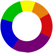
Now that we have analyzed the basic colors, let's look at how the associations between the various hues work. If you look at a color wheel, you can see, in the center, the
primary colors and on the outside the secondary colors. To get an effective color association, it would always be best to match a color to its complementary (which is
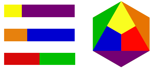
the sum of the two remaining primaries). The complementary colors are Red-Green, Yellow-Violet and Blue-Orange.
When two complementary colors are combined, they enhance each other by a process called simultaneous contrast. But how to balance
two complementary hues correctly?
When we want to balance two complementary colors in photography, we must consider that each hue has its own "visual weight" and that this should be properly
balanced between the two shades. When in a composition we find one color dominating over the other, it means that this proportion has not been correctly
respected and the cropping of the image should be reconsidered.
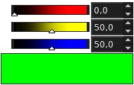
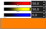
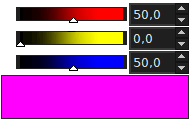
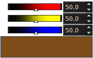
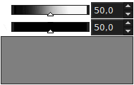
As you can see from the picture below, red and green have a 50% proportion, while in the case of the
yellow with purple or orange with blue you have to leave more room for the colder color, with a proportion of about 20/80 between yellow and purple and 30/70
between orange and blue. With these proportions each color expresses its maximum potential.
This information is somewhat difficult to put into practice in photography, but it's useful to remember that, in a photographic composition, if a small light spot contrasts with a large dark surface, immediately the whole photograph gets greater depth. The outnumbered color, finding itself diminished, "defends" itself by appearing brighter than when it's present in greater quantity. So remember: if you have a high-contrast detail, keep the frame wide, so the color has the space it needs to express itself.
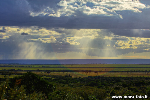
But what to do if the hues are all similar to each other? In this case, it's not a matter of creating a contrast, but of matching contiguous colors. Examples of similar hues include blue with green in panoramic shots or red with orange in autumn shots. Here we are helped by the table of quantitative color ratios between primary and secondary colors. In this record we can see the ratio we should leave between different hues in case of similar colors.
Following this pattern the results will be in perfect harmony, generating a sense of tranquility and balance in the observer. But how can we use these proportions in photography? As mentioned earlier, it's not possible to observe such precise patterns when we are framing a scene. Looking at the graphic, however, we can try to respect these proportions as much as possible when composing. Remember, however, that an image composed of very similar colors should not focus on contrast, but on harmony. In the image below you can see an example of balance between contiguous hues, which generates relaxation.
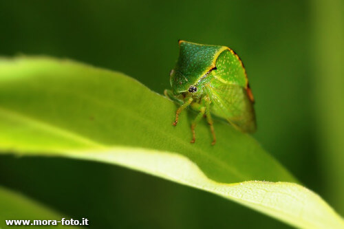
But what should we do in the case of monochrome photographs? In images composed of only one color, the same rule applies as in black and white. To avert the risk of the image appearing boring, we need to enhance geometries and textures. You can see an example in the photograph below, where a small green insect has been framed, resting on a green leaf framed with a green background.
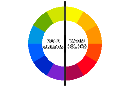
Warm and cold colors
The last theoretical point we are going to analyze are warm colors and cold colors, and then we'll conclude the article with some practical advice.
Colors are divided into warm and cold colors
based on the feelings of warmth they create in the observer. Warm colors are red, orange and yellow. Cold colors are blue, green and purple. In the diagram below
you can see a more complete breakdown:
Painters are masters at using color temperature to stir up emotion. Leonardo da Vinci first discovered that cold tones tend to move away from the viewer,
while warm colors tend to move closer. This phenomenon is known as Atmospheric Perspective and can be very useful in giving our shots greater depth.
Also, when two complementary colors are placed side by side, the warmer color usually attracts the most attention.
This information is very useful for composing photographs, as it allows us to increase the feeling of depth or shift the observer's attention to a particular subject. Obviously it will be easier to use these techniques in studio photography, but with luck, editing skills and the use of color balance it's possible to alter the hues of the image to match our needs, for example by applying a slight blue tint to the remote background of a panorama.
How to use this information in photography
Surely many of you must be thinking that this tutorial is largely useless, since in photography it's the subject that determines the color and not the contrary. Although this statement is partly correct, it's also true that the photographer, within certain limits, can decide which colors to include and which ones to exclude from a scene by changing the framing. The same panorama, moreover, will have different colors and arouse different emotions depending on the time of the day or year in which it's shooted. In the example image you can see two different photographs of the Three Peaks of Lavaredo taken at different times of the day and year. Please concentrate on the emotions they evoke before you continue reading.
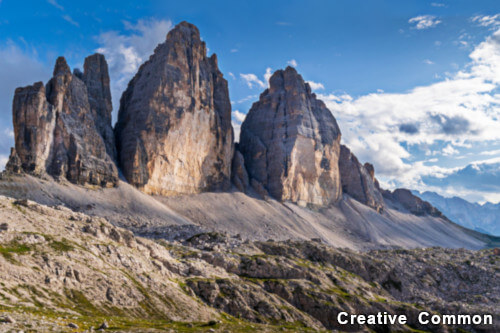
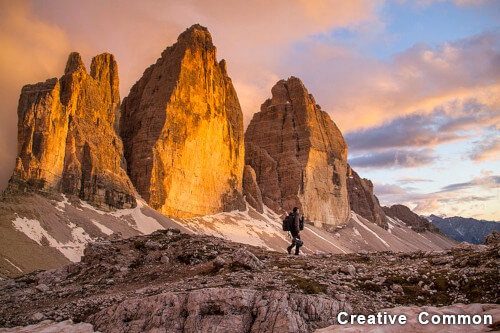
In the first image, the main tones are gray, blue and green. The photograph should evoke peace, quiet, well-being and solidity. The second shot on the other hand has orange, brown and a light splash of blue as the main tones. The photograph should elicit energy, but also genuineness. The second shot also is based on warm hues, so it should also give a sense of greater warmth. Can you tell?
From this example we can see that the photographer should know some element of color theory, since the effect of the photograph on the observer also depends to a good extent on the colors in the image and their juxtaposition. Just because color is everywhere does not mean that we should not pay attention to how it affects our images.
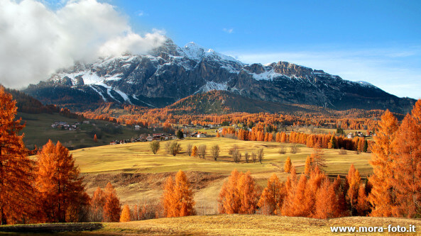
As a conclusion I would like to offer you this photo, which is the perfect summary of the article in its entirety. The warm tones in the foreground and the background tending toward blue greatly enhance the sense of perspective, and the various colors are properly proportioned to each other. I must admit that this photograph has always particularly appealed to me, long before I wrote this article, but I finally have one more element to understand why.
If you liked this tutorial here you can find all the other tutorials we wrote about photography, or you can go there to take a look to our tutorials for post production with Gimp. If you liked our work, you could consider to ❤support us: by clicking here you can see how.